
Blog Layout
Matrix - How to put the Measures in Rows in Power Bi
Jul 15, 2020
#PowerBI #Matrix #Visualization
Hello there,
How nice it is to have good
friends. A very good friend of mine sent me an excellent tip for those working with Power BI. Thank you, @Flavio. I really appreciate that. Here goes what he wrote for you:
"Hello Folks! Today I’m here to bring you a quick but handy tip for Power BI users!
It is not rare that we need to build views where you need to place in a grid the Metrics (Measure) values on the rows spot and have an attribute on the columns, producing this way a view that allows you to check multiple metrics values for a specific group of attribute values. It could be a time analysis or even a comparison between product categories.
In other BI tools, it is a straightforward task to display your grid with this specific layout. It is just a matter of placing your Attribute in the Columns and your Metrics or Measures in the Rows field. But not here in Power BI. First of all, if you want to control what you’ll place in the Rows and Columns, you’ll need to use the Matrix
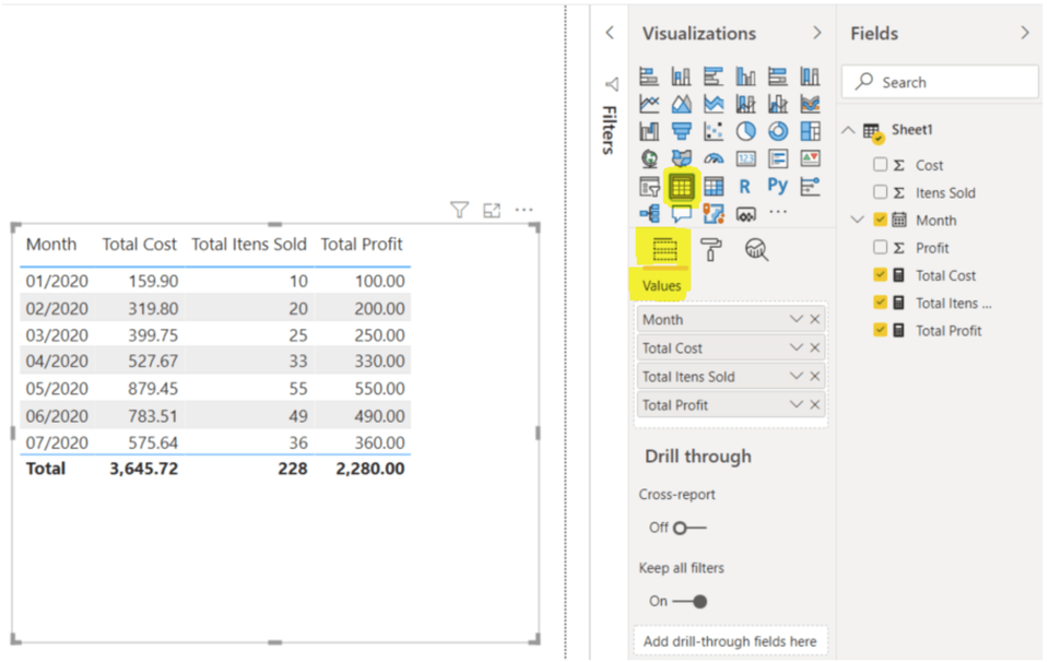
view instead of a Table. If you use the Table view, you only have the option to place the objects in a specific order, side by side. See it below:
While using the Matrix view, you could specify Rows and Columns.
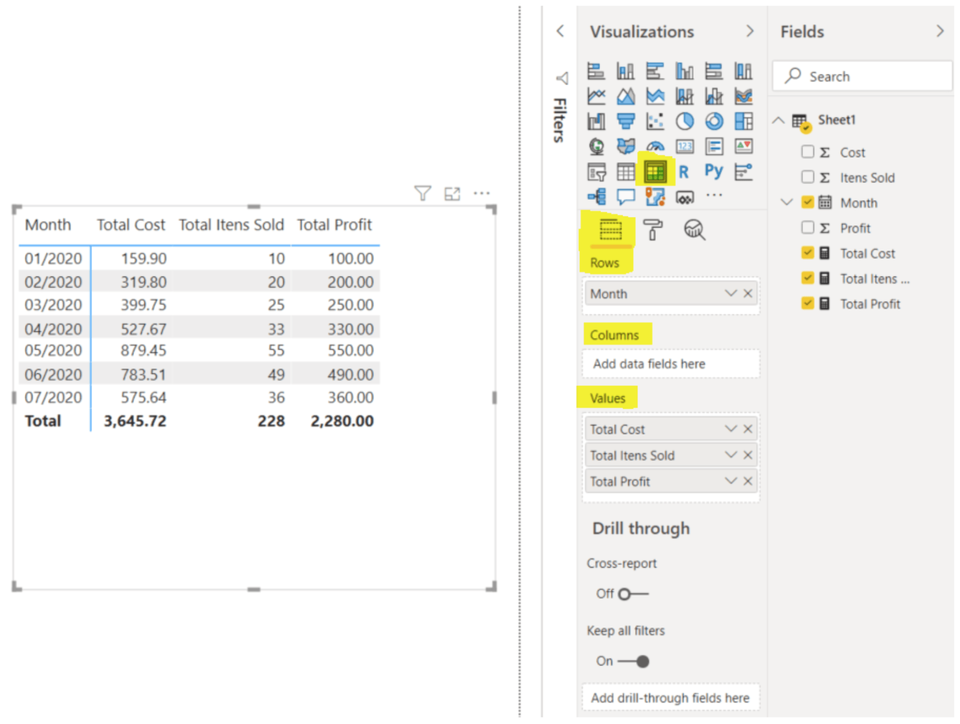
But if you want to achieve a view where you have your Metrics/Measures
names being displayed in the rows and the Attribute in the columns, you’ll need to use a trickier setting in the visualization. By having an attribute placed in the columns field, the tool does not allow you
to put the metric(s) in the Rows field, only in the values. It will produce a view that is not expected:
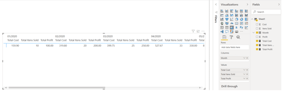
So, to have the metric titles in the rows, you’ll need to access the visualization settings, under the Values
option and toggle the option Show on Rows to ON.
Here is the result:

I hope it was as helpful to you guys as it was to me 😊!
Thanks, and see you later!"
Thank you, Flávio!
Cheers,
Felipe Vilela
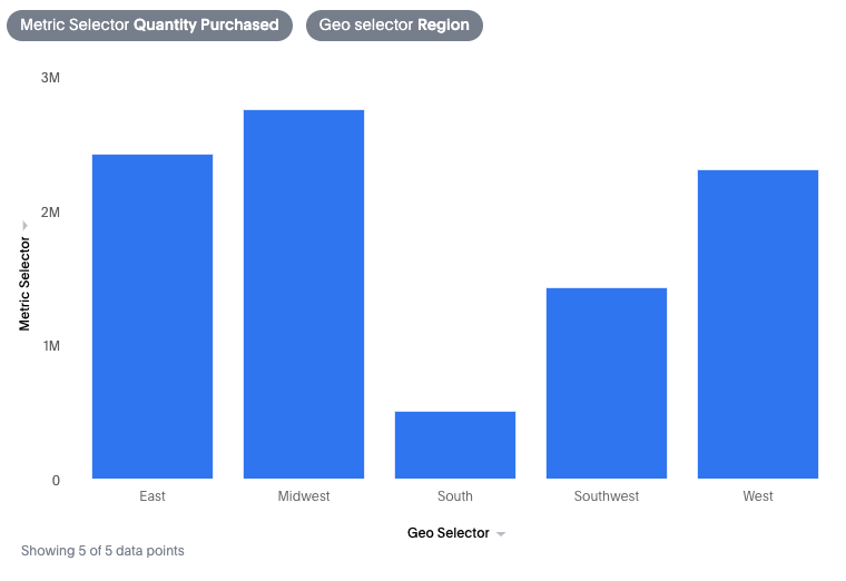
Parameters in ThoughtSpot are tremendous and can be used in many different ways. One of my favorites is switching attributes and metrics without needing the SQL to be re-generated. Let me show you how I do it: Create a worksheet and add two new parameters—one for the attributes and the other for the metrics . Geo Selector:
Enhance your google sheets with a ThoughtSpot extension for Free!

Our journey begins...